
How to use the Email Builder
The basics
The navigation menu bar
The email menu bar (see image below) is on top of the template.
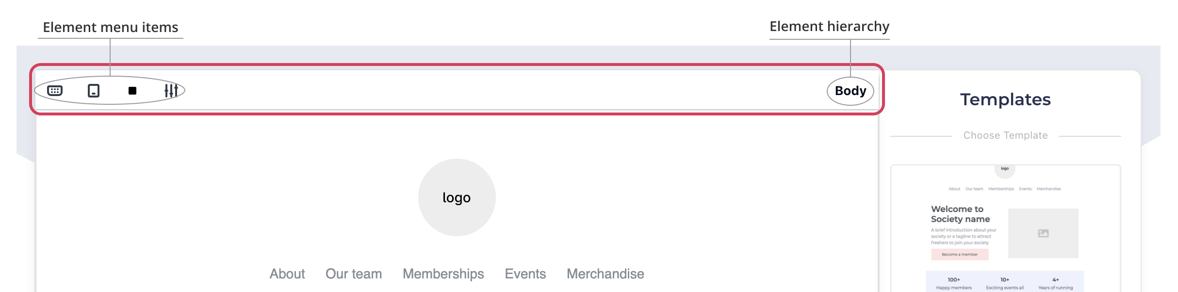
The main components of the menu bar are:
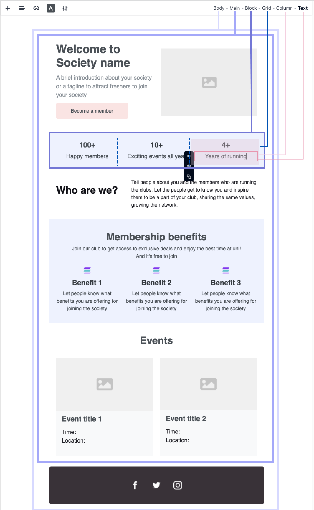
Element hierarchy
The element hierarchy shows the elements that define the body of your email. The hierarchy starts with the Body - the biggest element of all newsletters. As you add more elements in the body, which are the child elements, they will be shown on the right in the Element hierarchy, next to the Body.
The element that is selected on the Body, is always in bold shown at the end of the Element hierarchy, and the relationship of parent elements will be shown on the left in the hierarchy. See the example below:
Element menu items
Depending on the element that you select on the body, you might see different menu items related to that element, including:
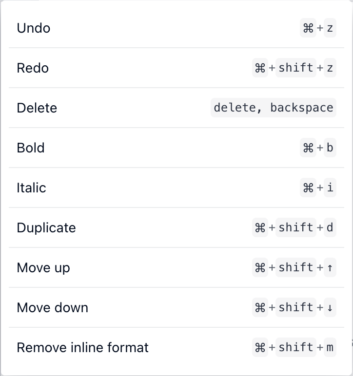
Shortcuts

This shows all the keyboard shortcuts that you can use in the Site Builders as below. This item is only applied to the Body.
Mobile view

Click this to see what your design will look like on the mobile. This item is only applied to the Body.
You cannot edit on Mobile view. To continue editing, you need to switch back to Desktop mode by click the Mobile view icon again when you are in Mobile view.
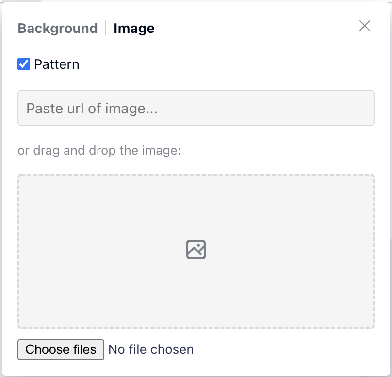
Background colour

You can select your email background colour here. You can either choose the colour in the grid or enter the HEX code underneath to apply a custom colour that is not available from the grid.
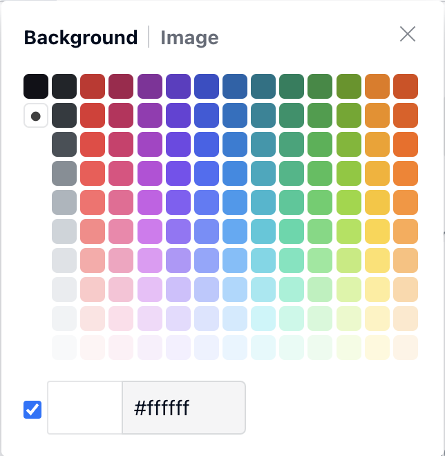
Alternatively, you can choose to upload an image as a background by choosing the “Image” tab
Settings

This is the settings of the selected element, which means the settings menu changes based on the different elements that you select. When you open the Settings menu, the heading of the menu indicates the selected element, which also shows in the Element hierarchy.

Often in Settings, you can adjust the padding and margin depending on the selected element:
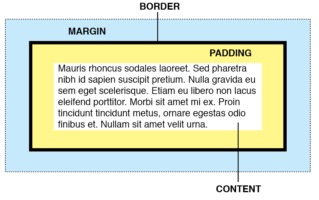
Padding | Padding is the spacing within an element. It pushes the content inside the element further in or out from the border. |
Margin | The spacing surrounding an element. It pushes other elements further away or closer to each other. |
Adjusting padding or margin | Enter the number value and pixel unit to adjust the spacing in the following order: top, right, bottom, left. For example: you want to adjust the text padding in a box as below 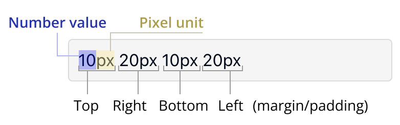 which translates to the visual as below 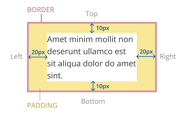 |
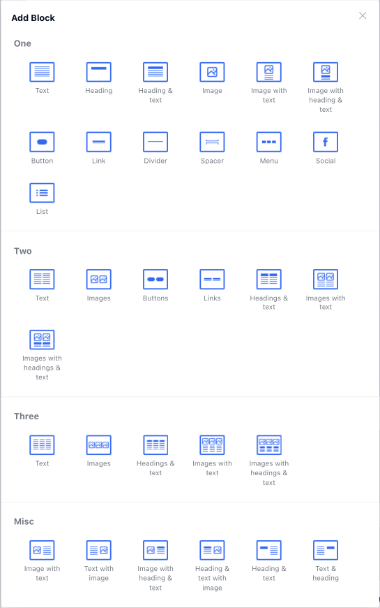
Add

You can add a block of any element under the selected element. You can choose any element from the block menu such as below
Alignment

Depending on the element, you can align the content within the element or the element itself in the left, right or middle.
Text colour

When selecting a text element, you can change the text colour by either choosing the colour in the grid or entering the HEX code to apply a custom colour that is not available from the grid.
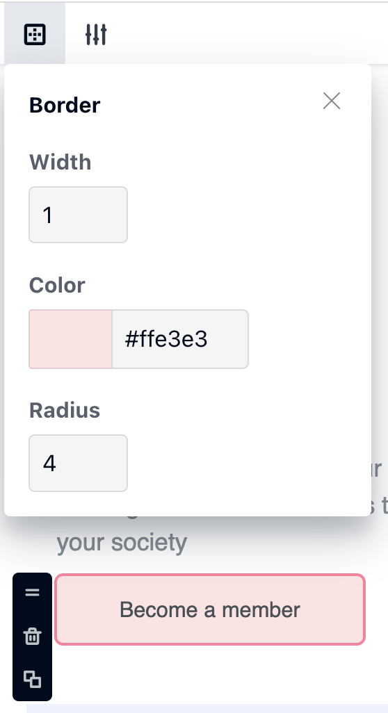
Border

This is usually applied for a Block, Image or Button element. You can change the radius, width and colour of the border. See the example of a button border settings below:
Border width: enter a number value to set the thickness of the border in pixels for the selected element. The higher the number, the thicker the border.
Colour: choose the colour of the border of the element, NOT the background colour of the element
Radius: enter a number value to set the roundness of the corners in pixels for the selected element. The higher the number, the rounder the corners.
Image

Click this if you want to change or upload an image
Link

This icon is applied for Text element only. It is useful for attaching a link with a text phrase.
This is NOT applicable for Image element. If you want to attach a link with an image, select the image element, then choose “Settings” icon from the menu navigation bar, you can enter the URL that you want to attach to the image there.
Items

This icon is available when you select a Menu or Social media element in the Body. It contains settings that allow you to set up different menu items, or icons (for social media) and attach the links to each item.
How to edit an element
Hover over the element that you want to edit and click to select it.
Alternatively, you can select the element from the Element Hierarchy, in case you can’t select the desired element when hovering over it.Once an element is selected, you can select the top menu items to edit the element accordingly.
Or from the black vertical side menu of the selected element (see image below), you can also:
 | Drag to move or reorder the element within the body |
 | Delete the element |
 | Duplicate the element |

How to add an element
To add a block in the Body
Select a block in the Body where you want to add a block underneath.
Then click the “Add” icon which will open a menu of all the elements that you can add.
Select the element you want to add to the body.
If needed, choose the Drag icon from the element’s side menu to move the element to wherever you like.
.gif?inst-v=a2b60bc6-6bc0-4a5d-9109-546c225050b8)
To add an element within a Block or a Parent element
Select an element within a block where you want to add an element.
Then click the “Add” icon which will open a menu of all the elements that you can add,
Select the element you want to add inside the block.
If needed, choose the Drag icon from the element’s side menu to move the element to where you need it to be.
Below is an example of how you can add social links of a team member, underneath the team role, just like the first team member’s details..gif?inst-v=a2b60bc6-6bc0-4a5d-9109-546c225050b8)